These are the pictures I have taken as possibilities for the front cover and contents page of my magazine. They create the image I was intending them to have as the children are wearing school uniform which is perfect for a school magazine. The variety of individuals and groups in the pictures opens up several different routes which can be taken with the magazine and also helps towards a range of pictures on the contents page. I will chose which ones to use for which purposes later depending on which look best in which place and taking into consideration that some may not be suitable due to blurring or scenery.
Monday, 24 October 2011
Monday, 17 October 2011
Font Ideas
In order to decide on a font for my magazine front cover I tested out which different styles and colours I would prefer to use and which would be most suited to the type of magazine I desire. I felt that a serif font would be best due to the official look I am trying to achieve with my magazine. To help towards this look further I also saw that I needed the font to be fairly simple and as with any magazine, easily legible as to not confuse or put of prospective readers. For these reasons I chose the font "Weathered SF" as you can see in the left hand column.
In the column I have tested different colours and backgrounds with it in order to see which suited the look I was going for and would work with the font. I chose not to add any colouring to my title font however as I felt the most professional look would be that of plain black.
Tuesday, 11 October 2011
Practice Pictures
These pictures are just an initial practice of an idea from which I will build. They are simply a rough idea of what I would like the final picture to look like. I have gone for a personal feel to take into consideration how it can be relaxing and enjoyable and to highlight that the magazine is friendly and easy to relate to, which is a big aspect for people of this age, especially under a large amount of pressure if the magazine is focused at those taking GCSEs currently.
Photo Research
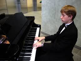
Professional: These pictures hint at excellence in music which could be fitting in a school music magazine as most schools attempt to encourage students to 'aim high'. This sort of picture could also inspire the student, which is another main aspect of what a school would be attempting to do for their pupils. This sort of picture would also look appealing on the front cover of a magazine and could provoke interest towards reading it. However I do not have the resources to take such a picture at the moment so it may not be the best option for me.
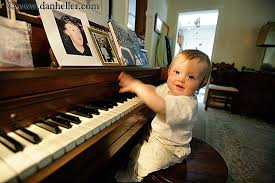
Personal: This type of picture creates a feeling of comfort and homeliness and also emphasizes the way in which learning to play an instrument does not have to be stressful and can be relaxing and lighthearted. The family support shown to be given in the first picture also gives an encouraging feel to the image. This may not be the best kind of picture for my front cover as it does not necessarily look professional, however this is the easiest type of picture for me to reproduce for my work.

Simple: This kind of picture may be the answer. The simplicity of the picture means that it would give off the message without looking as if it is making too much effort. It would mean that the features on the front page would be the main focus and the page would not look too busy, which can make a magazine look messy and cluttered. This type of picture would be slightly harder to produce than the above yet would be much more effective.
Monday, 10 October 2011
Research
To go with my new idea of a music themed school magazine I have found a few examples of front covers of similar music oriented school magazines. The two are extremely different looking, a main reason for this probably being the ages of the target market. The first picture of "primary music today" is simple and puts across the clear point of who and what the magazine is about. This does not include any further information or any text about features or other aspects of the magazine. The picture of "intune" magazine is however a lot more busy and engaging and is more of a teenage publication. We can also see this in the usage of a very recognisable reference to a film mainly targeting teens. This 'High School Musical' feature is the most accentuated and focused on in the page and would definitely be interesting towards many teenagers. This front cover holds a lot more information and features, drawing in the reader. Each individual magazine works successfully for its specific target age group. The last magazine, which looks the most professional of the 3 magazines is both simple and engaging. The use of the interesting and unusual image on the front cover draws us in and we can tell what the features are without the writing drawing away from the picture. Any information given is made clear and we know exactly what is trying to be put across from the magazine.
Sunday, 2 October 2011
Revised Concept
Another possible direction to head in would be a school music magazine, based around helping students in their school music classes and possibly other extracurricular focuses on music for people of a certain age. This target audience would probably be from around year 7 (11/12 year olds) to year 9 (13/14 year old) or GCSE level students (14-16 year olds). The difference between this age gap would affect the magazine greatly by whichever idea I chose. For example everything down to the wording and layout would have to take into consideration how young the readers would be for the younger concept whereas for the GSCE students a more mature approach would be taken due to students of this age taking themselves and their work more seriously.
Subscribe to:
Posts (Atom)